This topic contains 84 replies, has 18 voices, and was last updated by ![]()
ghrghr 14 years, 11 months ago.
- AuthorPosts
- Posted on: Fri, 08/19/2011 - 10:43am #32705


TC_42ParticipantMy last threads about the Washington and OKC redesigns generated some good discussion, so I’m going to post a few more new teams.
Today is a redesign of the Nuggets. The idea behind these designs is to make the logo and colors make more sense. With Washington (http://www.nbadraft.net/forum/washington-wizards-redesign), the idea was to go with a monetary theme to tie the Federal Reserve in DC. With OKC (http://www.nbadraft.net/forum/okc-thunder-redesign), the idea was the tie the logo and colors to… well, thunder.
The logic here is that nuggets are gold and not yellow, and I just personally love incorporating retro logos.
New logo:
Home uni:
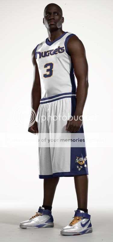
Away uni:
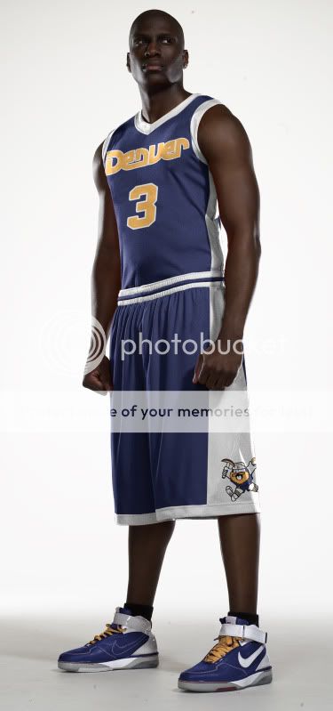
Alt uni:
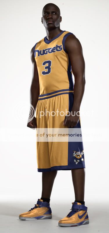
Court:

Yay? Nay?
(Designs courtesy of Tim E. O’Brien)
0 - Posted on: Fri, 08/19/2011 - 10:50am #592015
B-ball fanParticipantPersonally, I don’t like Denver’s current uni, and this looks much cooler.
0 - Posted on: Fri, 08/19/2011 - 10:50am #592040
B-ball fanParticipantPersonally, I don’t like Denver’s current uni, and this looks much cooler.
0 - Posted on: Fri, 08/19/2011 - 10:50am #591578
B-ball fanParticipantPersonally, I don’t like Denver’s current uni, and this looks much cooler.
0 - Posted on: Fri, 08/19/2011 - 10:56am #592017
TC_42ParticipantHere’s another redesign based off of the city of Denver’s flag…
Flag:

Home uni: http://www.timeobrien.com/picture/nuggs_npc_bb_h_4.jpg?pictureId=8793598
Away uni: http://www.timeobrien.com/picture/nuggs_npc_bb_h_3.jpg?pictureId=8793592
A little loud, but I’ve always liked a red, blue, and yellow color scheme.
0 - Posted on: Fri, 08/19/2011 - 10:56am #592043
TC_42ParticipantHere’s another redesign based off of the city of Denver’s flag…
Flag:
Home uni: http://www.timeobrien.com/picture/nuggs_npc_bb_h_4.jpg?pictureId=8793598
Away uni: http://www.timeobrien.com/picture/nuggs_npc_bb_h_3.jpg?pictureId=8793592
A little loud, but I’ve always liked a red, blue, and yellow color scheme.
0 - Posted on: Fri, 08/19/2011 - 10:56am #591580
TC_42ParticipantHere’s another redesign based off of the city of Denver’s flag…
Flag:
Home uni: http://www.timeobrien.com/picture/nuggs_npc_bb_h_4.jpg?pictureId=8793598
Away uni: http://www.timeobrien.com/picture/nuggs_npc_bb_h_3.jpg?pictureId=8793592
A little loud, but I’ve always liked a red, blue, and yellow color scheme.
0 - Posted on: Fri, 08/19/2011 - 11:41am #592032

Anton123ParticipantWhy have a drunk funky miner on your logo?
0 - Posted on: Fri, 08/19/2011 - 11:41am #592059
Anton123ParticipantWhy have a drunk funky miner on your logo?
0 - Posted on: Fri, 08/19/2011 - 11:41am #591595
Anton123ParticipantWhy have a drunk funky miner on your logo?
0 - Posted on: Fri, 08/19/2011 - 11:43am #592035

rileymcshea3ParticipantHow do you make these? Is there like a website or something?
0 - Posted on: Fri, 08/19/2011 - 11:43am #592062
rileymcshea3ParticipantHow do you make these? Is there like a website or something?
0 - Posted on: Fri, 08/19/2011 - 11:43am #591598
rileymcshea3ParticipantHow do you make these? Is there like a website or something?
0 - Posted on: Fri, 08/19/2011 - 11:45am #592038

PrecociousNeophyteParticipantThis one is pretty sick. Out of the three I like this one the best.
0 - Posted on: Fri, 08/19/2011 - 11:45am #592065
PrecociousNeophyteParticipantThis one is pretty sick. Out of the three I like this one the best.
0 - Posted on: Fri, 08/19/2011 - 11:45am #591601
PrecociousNeophyteParticipantThis one is pretty sick. Out of the three I like this one the best.
0 - Posted on: Fri, 08/19/2011 - 12:02pm #592049
boffacheeriosParticipantare you guys serious? this is a pro frachise not a jr high aau team, the crazy hobo miner looks like it was made with ms paint and has anyone else noticed that every set of unis are the same design with different color schemes and faunts? jesus christ
0 - Posted on: Fri, 08/19/2011 - 12:02pm #592077
boffacheeriosParticipantare you guys serious? this is a pro frachise not a jr high aau team, the crazy hobo miner looks like it was made with ms paint and has anyone else noticed that every set of unis are the same design with different color schemes and faunts? jesus christ
0 - Posted on: Fri, 08/19/2011 - 12:02pm #591613
boffacheeriosParticipantare you guys serious? this is a pro frachise not a jr high aau team, the crazy hobo miner looks like it was made with ms paint and has anyone else noticed that every set of unis are the same design with different color schemes and faunts? jesus christ
0 - Posted on: Fri, 08/19/2011 - 12:05pm #592052

WizardofOzParticipantThose actually look pretty decent IMO.
But the current Denver jerseys look better to me with the shiny fabric than with the current fabric they use. That’s my opinion though.
0 - Posted on: Fri, 08/19/2011 - 12:05pm #592080
WizardofOzParticipantThose actually look pretty decent IMO.
But the current Denver jerseys look better to me with the shiny fabric than with the current fabric they use. That’s my opinion though.
0 - Posted on: Fri, 08/19/2011 - 12:05pm #591615
WizardofOzParticipantThose actually look pretty decent IMO.
But the current Denver jerseys look better to me with the shiny fabric than with the current fabric they use. That’s my opinion though.
0 - Posted on: Fri, 08/19/2011 - 12:19pm #591625
rileymcshea3ParticipantDude chill out its just like a rough draft
0 - Posted on: Fri, 08/19/2011 - 12:19pm #592061
rileymcshea3ParticipantDude chill out its just like a rough draft
0 - Posted on: Fri, 08/19/2011 - 12:19pm #592089
rileymcshea3ParticipantDude chill out its just like a rough draft
0 - Posted on: Fri, 08/19/2011 - 12:40pm #591631
rileymcshea3ParticipantI would like to see you make a new Charlotte team name and logo
Like a Charlotte Saber Tooths logo that would be sweet if there colors were Orange and White
Or Charlotte Skorpians
Or Charlotte Pythons with Black and Green
0 - Posted on: Fri, 08/19/2011 - 12:40pm #592067
rileymcshea3ParticipantI would like to see you make a new Charlotte team name and logo
Like a Charlotte Saber Tooths logo that would be sweet if there colors were Orange and White
Or Charlotte Skorpians
Or Charlotte Pythons with Black and Green
0 - Posted on: Fri, 08/19/2011 - 12:40pm #592095
rileymcshea3ParticipantI would like to see you make a new Charlotte team name and logo
Like a Charlotte Saber Tooths logo that would be sweet if there colors were Orange and White
Or Charlotte Skorpians
Or Charlotte Pythons with Black and Green
0 - Posted on: Fri, 08/19/2011 - 1:08pm #591640

Chilbert arenasParticipantI hate the tight top with huge shorts just like Kentucky Oregon and all college teams associated with Nike. Don’t like their current ones but they could have done better. Those shorts look rediculous
0 - Posted on: Fri, 08/19/2011 - 1:08pm #592076
Chilbert arenasParticipantI hate the tight top with huge shorts just like Kentucky Oregon and all college teams associated with Nike. Don’t like their current ones but they could have done better. Those shorts look rediculous
0 - Posted on: Fri, 08/19/2011 - 1:08pm #592104
Chilbert arenasParticipantI hate the tight top with huge shorts just like Kentucky Oregon and all college teams associated with Nike. Don’t like their current ones but they could have done better. Those shorts look rediculous
0 - Posted on: Fri, 08/19/2011 - 1:15pm #591643

Tongue-Out-Like-23ParticipantIs this a daycare in Denver or a professional NBA team?
0 - Posted on: Fri, 08/19/2011 - 1:15pm #592079
Tongue-Out-Like-23ParticipantIs this a daycare in Denver or a professional NBA team?
0 - Posted on: Fri, 08/19/2011 - 1:15pm #592107
Tongue-Out-Like-23ParticipantIs this a daycare in Denver or a professional NBA team?
0 - Posted on: Fri, 08/19/2011 - 1:45pm #591655
TC_42ParticipantApparently some people aren’t aware this was the Nuggets logo from 1974-81?
 0
0 - Posted on: Fri, 08/19/2011 - 1:45pm #592091
TC_42ParticipantApparently some people aren’t aware this was the Nuggets logo from 1974-81?
0 - Posted on: Fri, 08/19/2011 - 1:45pm #592119
TC_42ParticipantApparently some people aren’t aware this was the Nuggets logo from 1974-81?
0 - Posted on: Fri, 08/19/2011 - 2:39pm #592135

BasketBalAllanParticipantI have to say; out of the three redesign threads, this is how I would rate them on a scale of 1-10 (ten being amazing, one being terrible):
Washington: 6: dislike the color scheme and the uniforms but think it is a clever idea, perhaps a color change to dark blue and gold with a little red (like the FBI).
OKC: 8: I love trying to work a physical entity into their team, since they are named for a sound, the look seems polished and well thought out, and the colors look great. However (strangely) there seems to be a lack of knowledge throughout the public as to what a bison is…
Denver: 3: while in dire need of a different look, the Nuggets do not need to appear as if a fourth grader designed their logo. The only two aspects of this I enjoy is the realization that they need to change and the transition from yellow to gold. Everything else needs to be more modern, eye-catching, and much less simple.
0 - Posted on: Fri, 08/19/2011 - 2:39pm #591669
BasketBalAllanParticipantI have to say; out of the three redesign threads, this is how I would rate them on a scale of 1-10 (ten being amazing, one being terrible):
Washington: 6: dislike the color scheme and the uniforms but think it is a clever idea, perhaps a color change to dark blue and gold with a little red (like the FBI).
OKC: 8: I love trying to work a physical entity into their team, since they are named for a sound, the look seems polished and well thought out, and the colors look great. However (strangely) there seems to be a lack of knowledge throughout the public as to what a bison is…
Denver: 3: while in dire need of a different look, the Nuggets do not need to appear as if a fourth grader designed their logo. The only two aspects of this I enjoy is the realization that they need to change and the transition from yellow to gold. Everything else needs to be more modern, eye-catching, and much less simple.
0 - Posted on: Fri, 08/19/2011 - 2:39pm #592106
BasketBalAllanParticipantI have to say; out of the three redesign threads, this is how I would rate them on a scale of 1-10 (ten being amazing, one being terrible):
Washington: 6: dislike the color scheme and the uniforms but think it is a clever idea, perhaps a color change to dark blue and gold with a little red (like the FBI).
OKC: 8: I love trying to work a physical entity into their team, since they are named for a sound, the look seems polished and well thought out, and the colors look great. However (strangely) there seems to be a lack of knowledge throughout the public as to what a bison is…
Denver: 3: while in dire need of a different look, the Nuggets do not need to appear as if a fourth grader designed their logo. The only two aspects of this I enjoy is the realization that they need to change and the transition from yellow to gold. Everything else needs to be more modern, eye-catching, and much less simple.
0 - Posted on: Fri, 08/19/2011 - 3:13pm #592149
Penny Jr.ParticipantOut of all them the nuggets jersey is the best but the logo looks like a crackheaded super mario lmao
0 - Posted on: Fri, 08/19/2011 - 3:13pm #591684
Penny Jr.ParticipantOut of all them the nuggets jersey is the best but the logo looks like a crackheaded super mario lmao
0 - Posted on: Fri, 08/19/2011 - 3:13pm #592121
Penny Jr.ParticipantOut of all them the nuggets jersey is the best but the logo looks like a crackheaded super mario lmao
0 - Posted on: Fri, 08/19/2011 - 3:24pm #592152

Malik-UniversalParticipanti honestly dont like any of these re-designs
0 - Posted on: Fri, 08/19/2011 - 3:24pm #591687
Malik-UniversalParticipanti honestly dont like any of these re-designs
0 - Posted on: Fri, 08/19/2011 - 3:24pm #592124
Malik-UniversalParticipanti honestly dont like any of these re-designs
0 - Posted on: Fri, 08/19/2011 - 4:27pm #592130
Kinguy11ParticipantPretty good, but I do like your OKC one better
0 - Posted on: Fri, 08/19/2011 - 4:27pm #592159
Kinguy11ParticipantPretty good, but I do like your OKC one better
0 - Posted on: Fri, 08/19/2011 - 4:27pm #591693
Kinguy11ParticipantPretty good, but I do like your OKC one better
0 - Posted on: Fri, 08/19/2011 - 4:29pm #592136
aamir543ParticipantI love the Wizards one, but not the past two. Nor the ones from last year, like the Sixers and the Jazz.
0 - Posted on: Fri, 08/19/2011 - 4:29pm #592165
aamir543ParticipantI love the Wizards one, but not the past two. Nor the ones from last year, like the Sixers and the Jazz.
0 - Posted on: Fri, 08/19/2011 - 4:29pm #591699
aamir543ParticipantI love the Wizards one, but not the past two. Nor the ones from last year, like the Sixers and the Jazz.
0 - Posted on: Fri, 08/19/2011 - 4:37pm #592139
GrovesinternationalParticipant^i agree with universal… and in particular i think the logos are terrible. however the okc colour scheme is kind of cool
0 - Posted on: Fri, 08/19/2011 - 4:37pm #592168
GrovesinternationalParticipant^i agree with universal… and in particular i think the logos are terrible. however the okc colour scheme is kind of cool
0 - Posted on: Fri, 08/19/2011 - 4:37pm #591701
GrovesinternationalParticipant^i agree with universal… and in particular i think the logos are terrible. however the okc colour scheme is kind of cool
0 - Posted on: Fri, 08/19/2011 - 4:53pm #592145
TC_42ParticipantOk, well I appreciate all the feedback. And since nobody really likes the logo, just imagine this logo with the new colorization (the gold and darker blue):

Although it’s their current alternate logo, it’s one of my favorite logos in all of sports. IMO, I would like it to be their primary.
0 - Posted on: Fri, 08/19/2011 - 4:53pm #592174
TC_42ParticipantOk, well I appreciate all the feedback. And since nobody really likes the logo, just imagine this logo with the new colorization (the gold and darker blue):
Although it’s their current alternate logo, it’s one of my favorite logos in all of sports. IMO, I would like it to be their primary.
0 - Posted on: Fri, 08/19/2011 - 4:53pm #591708
TC_42ParticipantOk, well I appreciate all the feedback. And since nobody really likes the logo, just imagine this logo with the new colorization (the gold and darker blue):
Although it’s their current alternate logo, it’s one of my favorite logos in all of sports. IMO, I would like it to be their primary.
0- Posted on: Fri, 08/19/2011 - 9:41pm #592208

Tim E. O’BrienParticipantHere’s how I’d recolor that logo:
And it’s not blue, it’s not a darker blue, it’s a purple – as in royalty, the people who have lots of gold.
0 - Posted on: Fri, 08/19/2011 - 9:41pm #592238
Tim E. O’BrienParticipantHere’s how I’d recolor that logo:
And it’s not blue, it’s not a darker blue, it’s a purple – as in royalty, the people who have lots of gold.
0 - Posted on: Fri, 08/19/2011 - 9:41pm #591770
Tim E. O’BrienParticipantHere’s how I’d recolor that logo:
And it’s not blue, it’s not a darker blue, it’s a purple – as in royalty, the people who have lots of gold.
0
- Posted on: Fri, 08/19/2011 - 4:55pm #592148
rileymcshea3ParticipantHow do you make them!?
0 - Posted on: Fri, 08/19/2011 - 4:55pm #592177
rileymcshea3ParticipantHow do you make them!?
0 - Posted on: Fri, 08/19/2011 - 4:55pm #591710
rileymcshea3ParticipantHow do you make them!?
0 - Posted on: Fri, 08/19/2011 - 6:43pm #592175
NCarmean18ParticipantI really like the uniforms, but as far as the uniforms or stadium flooring, I’m not really feeling it. I do like the uniforms as I said though. It would be unique if they could mix those colors with the current logy and create uniforms like that. It’d be something to see.
Good post though, man.
0 - Posted on: Fri, 08/19/2011 - 6:43pm #592204
NCarmean18ParticipantI really like the uniforms, but as far as the uniforms or stadium flooring, I’m not really feeling it. I do like the uniforms as I said though. It would be unique if they could mix those colors with the current logy and create uniforms like that. It’d be something to see.
Good post though, man.
0 - Posted on: Fri, 08/19/2011 - 6:43pm #591737
NCarmean18ParticipantI really like the uniforms, but as far as the uniforms or stadium flooring, I’m not really feeling it. I do like the uniforms as I said though. It would be unique if they could mix those colors with the current logy and create uniforms like that. It’d be something to see.
Good post though, man.
0 - Posted on: Fri, 08/19/2011 - 6:45pm #592178
TC_42ParticipantPhotoshop or a similar program.
0 - Posted on: Fri, 08/19/2011 - 6:45pm #592207
TC_42ParticipantPhotoshop or a similar program.
0 - Posted on: Fri, 08/19/2011 - 6:45pm #591740
TC_42ParticipantPhotoshop or a similar program.
0 - Posted on: Fri, 08/19/2011 - 8:54pm #592196
Tim E. O’BrienParticipantHi everybody, My name is Tim E. O’Brien and I am the creator of all of these NBA rebrands (the wiz/feds, thunder and nuggets).
While I don’t mind my work being spread throughout the interwebs (I’m told they’re a series of tubes), I would just like to make it crystal clear that TC_42 did not create these (nor has he taken credit for them) I did.
If you would like to see more or read my explanations of these redesigns, please visit my website @ TimEOBrien.com There you will find NBA, NFL, NHL and MLB redesigns and a plethora of other works I hope you enjoy.
Now to answer some Questions and Comments:
I make the uniform concepts in Photoshop CS5 (which is VERY expensive, sorry people who want to do this with MS Paint, etc.) using a basketball template which is originally based on Nike’s System of a Dress basketball uniforms (OSU, Florida, Kentucky, etc.). The template is not my own (unlike my MLB or NHL templates) so if you don’t like the cut of the uniform, just imagine it more along the lines of an NBA cut with my theorized designs on it.
As for the ‘amateur’ logo in this design, As TC_42 points out, this is – verbatum excluding color – a copy of the Nuggets logo in the late 70s and early 80s. This is not my own design.
I know not everyone will like everything I create, but I hope people can take something away from each design.
Cheers.
0 - Posted on: Fri, 08/19/2011 - 8:54pm #592225
Tim E. O’BrienParticipantHi everybody, My name is Tim E. O’Brien and I am the creator of all of these NBA rebrands (the wiz/feds, thunder and nuggets).
While I don’t mind my work being spread throughout the interwebs (I’m told they’re a series of tubes), I would just like to make it crystal clear that TC_42 did not create these (nor has he taken credit for them) I did.
If you would like to see more or read my explanations of these redesigns, please visit my website @ TimEOBrien.com There you will find NBA, NFL, NHL and MLB redesigns and a plethora of other works I hope you enjoy.
Now to answer some Questions and Comments:
I make the uniform concepts in Photoshop CS5 (which is VERY expensive, sorry people who want to do this with MS Paint, etc.) using a basketball template which is originally based on Nike’s System of a Dress basketball uniforms (OSU, Florida, Kentucky, etc.). The template is not my own (unlike my MLB or NHL templates) so if you don’t like the cut of the uniform, just imagine it more along the lines of an NBA cut with my theorized designs on it.
As for the ‘amateur’ logo in this design, As TC_42 points out, this is – verbatum excluding color – a copy of the Nuggets logo in the late 70s and early 80s. This is not my own design.
I know not everyone will like everything I create, but I hope people can take something away from each design.
Cheers.
0 - Posted on: Fri, 08/19/2011 - 8:54pm #591758
Tim E. O’BrienParticipantHi everybody, My name is Tim E. O’Brien and I am the creator of all of these NBA rebrands (the wiz/feds, thunder and nuggets).
While I don’t mind my work being spread throughout the interwebs (I’m told they’re a series of tubes), I would just like to make it crystal clear that TC_42 did not create these (nor has he taken credit for them) I did.
If you would like to see more or read my explanations of these redesigns, please visit my website @ TimEOBrien.com There you will find NBA, NFL, NHL and MLB redesigns and a plethora of other works I hope you enjoy.
Now to answer some Questions and Comments:
I make the uniform concepts in Photoshop CS5 (which is VERY expensive, sorry people who want to do this with MS Paint, etc.) using a basketball template which is originally based on Nike’s System of a Dress basketball uniforms (OSU, Florida, Kentucky, etc.). The template is not my own (unlike my MLB or NHL templates) so if you don’t like the cut of the uniform, just imagine it more along the lines of an NBA cut with my theorized designs on it.
As for the ‘amateur’ logo in this design, As TC_42 points out, this is – verbatum excluding color – a copy of the Nuggets logo in the late 70s and early 80s. This is not my own design.
I know not everyone will like everything I create, but I hope people can take something away from each design.
Cheers.
0 - Posted on: Sat, 08/20/2011 - 4:55am #592240
TC_42ParticipantSorry, Tim. While I did put your name at the end of the posts, I only included a link to your website on the OKC thread because I wanted to reveal them gradually to get more individual discussion (so everybody just didn’t go through and look at them all at once on your site).
I just like to post different logo redesigns (in my first Washington thread, I did say that I "stumbled across it"). So yeah, I’m definitely not trying to take credit. When riley said, "How do you make them?", I took at as in general, not how do I personally make them.
A few weeks ago, I also posted some redesigns from Michael Weinstein (with his name and a link). So you may be interested in checking them out: http://www.michael-weinstein.com/2010/11/nba-team-logo-redesigns/
0 - Posted on: Sat, 08/20/2011 - 4:55am #592271
TC_42ParticipantSorry, Tim. While I did put your name at the end of the posts, I only included a link to your website on the OKC thread because I wanted to reveal them gradually to get more individual discussion (so everybody just didn’t go through and look at them all at once on your site).
I just like to post different logo redesigns (in my first Washington thread, I did say that I "stumbled across it"). So yeah, I’m definitely not trying to take credit. When riley said, "How do you make them?", I took at as in general, not how do I personally make them.
A few weeks ago, I also posted some redesigns from Michael Weinstein (with his name and a link). So you may be interested in checking them out: http://www.michael-weinstein.com/2010/11/nba-team-logo-redesigns/
0 - Posted on: Sat, 08/20/2011 - 4:55am #591804
TC_42ParticipantSorry, Tim. While I did put your name at the end of the posts, I only included a link to your website on the OKC thread because I wanted to reveal them gradually to get more individual discussion (so everybody just didn’t go through and look at them all at once on your site).
I just like to post different logo redesigns (in my first Washington thread, I did say that I "stumbled across it"). So yeah, I’m definitely not trying to take credit. When riley said, "How do you make them?", I took at as in general, not how do I personally make them.
A few weeks ago, I also posted some redesigns from Michael Weinstein (with his name and a link). So you may be interested in checking them out: http://www.michael-weinstein.com/2010/11/nba-team-logo-redesigns/
0 - Posted on: Sat, 08/20/2011 - 6:53am #592269
BasketBalAllanParticipantI cannot help but think that a purple and gold color scheme is already taken by a fairly famous team. If only I could remember their name…
0 - Posted on: Sat, 08/20/2011 - 6:53am #592301
BasketBalAllanParticipantI cannot help but think that a purple and gold color scheme is already taken by a fairly famous team. If only I could remember their name…
0 - Posted on: Sat, 08/20/2011 - 6:53am #591833
BasketBalAllanParticipantI cannot help but think that a purple and gold color scheme is already taken by a fairly famous team. If only I could remember their name…
0- Posted on: Sat, 08/20/2011 - 8:13am #591882
Tim E. O’BrienParticipantThat’s like saying only the clippers should wear red and blue, there are so many shades (laker gold is very yellow where as this gold is closer to ‘old gold’) that teams can have the same basic colors but look completely different.
Example: (LeBron era) Cleveland and the Clippers both wear (wore) red and blue.
0 - Posted on: Sat, 08/20/2011 - 8:13am #592317
Tim E. O’BrienParticipantThat’s like saying only the clippers should wear red and blue, there are so many shades (laker gold is very yellow where as this gold is closer to ‘old gold’) that teams can have the same basic colors but look completely different.
Example: (LeBron era) Cleveland and the Clippers both wear (wore) red and blue.
0 - Posted on: Sat, 08/20/2011 - 8:13am #592349
Tim E. O’BrienParticipantThat’s like saying only the clippers should wear red and blue, there are so many shades (laker gold is very yellow where as this gold is closer to ‘old gold’) that teams can have the same basic colors but look completely different.
Example: (LeBron era) Cleveland and the Clippers both wear (wore) red and blue.
0
- Posted on: Sat, 08/20/2011 - 10:33am #592402
ghrghrParticipantThe little miner is a pretty nice mascot. The problem for me is that while the miner has a retro style, the font you chose has not. The font does look OK in the logo but looks terrible to me in the uniforms.
0 - Posted on: Sat, 08/20/2011 - 10:33am #591932
ghrghrParticipantThe little miner is a pretty nice mascot. The problem for me is that while the miner has a retro style, the font you chose has not. The font does look OK in the logo but looks terrible to me in the uniforms.
0 - Posted on: Sat, 08/20/2011 - 10:33am #592367
ghrghrParticipantThe little miner is a pretty nice mascot. The problem for me is that while the miner has a retro style, the font you chose has not. The font does look OK in the logo but looks terrible to me in the uniforms.
0 - AuthorPosts
| You must be logged in to reply to this topic. | Login |