This topic contains 13 replies, has 10 voices, and was last updated by ![]()
![]() Charlie Sheen 12 years, 11 months ago.
Charlie Sheen 12 years, 11 months ago.
- AuthorPosts
- Posted on: Mon, 05/02/2011 - 10:56am #28503


TC_42Participant
Love the Clippers and Nets idea. The Hornets is decent, but the Warriors kinda feels like the OKC logo. Not bad though.
0 - Posted on: Mon, 05/02/2011 - 11:00am #527704

Tongue-Out-Like-23ParticipantI love the Warriors one!
I actually like them all. Alot better than their current logos.
0 - Posted on: Mon, 05/02/2011 - 11:03am #527706

i’m jus so offendedParticipantare these like actual ideas the team’s are thinking of switching to? I don’t get the clippers one…
0 - Posted on: Mon, 05/02/2011 - 11:08am #527708
TC_42ParticipantOh, sorry. They’re just ideas from graphic designers having fun.
On the Clippers… the rope makes LA (I didn’t catch that right way). And it’s an anchor… ya know? Clipper ship?
0 - Posted on: Mon, 05/02/2011 - 11:08am #527709

esperanzafleet69Participantdont understand the anchor
0 - Posted on: Mon, 05/02/2011 - 11:12am #527710
JimmeredYaWabafetParticipantthe Nets one is good but i like this one more http://www.brooklynnetstickets.com/images/brooklyn-nets-picture.jpg Hornets one is a good alternative type of logo. The other ones are ugly to me,though i think that Warrior logo is an upgrade from the one they have now,seriously dont get the appeal with the retro look.
0 - Posted on: Mon, 05/02/2011 - 11:46am #527719

DC ChillinParticipantThese logos are dope! I think the Wizards are about to get a new one too, their changing the color back to red white and blue.
0 - Posted on: Mon, 05/02/2011 - 12:58pm #527730
Stevenwow, i LOVE both nets ones!
0 - Posted on: Mon, 05/02/2011 - 2:10pm #527752
kaceyParticipantI believe the Wizards are going to showcase their new logo and jersey in about a week or so.
I love these designs, IMO they have this early 90’s – mid 90’s appeal to them. Kind of old school, but not a complete throw back to the old school look.
0 - Posted on: Mon, 05/02/2011 - 2:21pm #527758

JJeff6ParticipantI really like the Brooklyn Nets one. Its classy and old school in a way.
0 - Posted on: Mon, 05/02/2011 - 2:40pm #527765

Da1potParticipantLol… If the Clippers are trying to get out the get out of the bottom of the Western Conference I don’t know if a frickin anchor is the best design. I think a big ship would look kinda cool on a jersey though.
Rumor in D.C. right now is that Ted Leonsis( the Wiz Owner) is seriously considering changing the team name back to the Bullets!!!!!!!!
0 - Posted on: Mon, 05/02/2011 - 2:48pm #527768
TC_42Participantlol, good point about the anchor. I like this Clipper ship design for the Columbus Clippers is cool:
 0
0 - Posted on: Mon, 05/02/2011 - 2:54pm #527769
TC_42ParticipantKings. Love the “Kings” font. Cat is a bit weak.
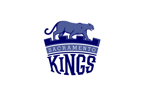
Alternate?
 0
0 - Posted on: Mon, 05/02/2011 - 3:23pm #527772

Charlie SheenParticipantThey reveal everything on May 10th
0 - AuthorPosts
| You must be logged in to reply to this topic. | Login |